How have you maintained a clear image and theme throughout your campaign?
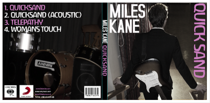
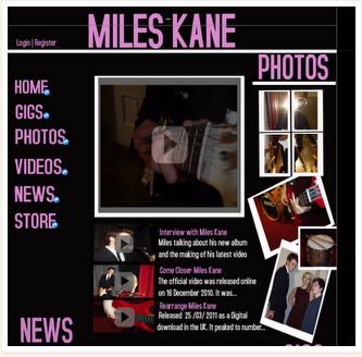
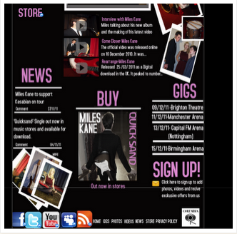
Throughout all of our products we have kept an emphasis on Miles Kane (Chris) for its image which is why he is the only person featured on the digipak and has most emphasis on the website and in our video. There is also a distinct colour scheme with the Digipak and website (pink, white and black) which makes them look united; the colour scheme wasn't included in the video because it wouldn't suit the song and would look silly.
How is the website, CD cover and video interrelated? Do they have the same purpose?
Our website, CD cover and video are interrelated due to having the same content regarding actors and theme. The website and digipak are interrelated with the colour scheme. All of our products have the same purpose in regards to selling Miles Kane, by making them all similar people are more likely to recognise his 'brand' and therefore let him stand out. To make him stand out all 3 of the products focus on him.
What purpose or relationship do they all have? Do they target the audience?
The purpose is to give Miles Kane an interesting image which people will want to buy into. The target audience of 16 - 25 year olds might not be achieved due to our actors being in the lower end of the target audience spectrum (17-18), however apart from that I think it would have done ok towards our target audience due to it having a similar style to Miles Kane's previous videos with the inclusion of dancing and focus on live performance.


No comments:
Post a Comment