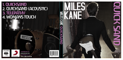
Showing posts with label George. Show all posts

Monday, 6 February 2012

How effective is the combination of your main product and ancillary texts?

Digipak Front Cover
Digipak Inside

Website


How have you maintained a clear image and theme throughout your campaign?
Throughout all of our products we have kept an emphasis on Miles Kane (Chris) for its image which is why he is the only person featured on the digipak and has most emphasis on the website and in our video. There is also a distinct colour scheme with the Digipak and website (pink, white and black) which makes them look united; the colour scheme wasn't included in the video because it wouldn't suit the song and would look silly.

How is the website, CD cover and video interrelated? Do they have the same purpose?
Our website, CD cover and video are interrelated due to having the same content regarding actors and theme. The website and digipak are interrelated with the colour scheme. All of our products have the same purpose in regards to selling Miles Kane, by making them all similar people are more likely to recognise his 'brand' and therefore let him stand out. To make him stand out all 3 of the products focus on him.

What purpose or relationship do they all have? Do they target the audience?
The purpose is to give Miles Kane an interesting image which people will want to buy into. The target audience of 16 - 25 year olds might not be achieved due to our actors being in the lower end of the target audience spectrum (17-18), however apart from that I think it would have done ok towards our target audience due to it having a similar style to Miles Kane's previous videos with the inclusion of dancing and focus on live performance.


Arctic Monkeys - Favourite Worst Nightmare Digipak

Other feedback sheets - Sophie

These are the other feedback sheets we collected from are audience, overall they are positive comments. 


Monday, 30 January 2012

Evaluations

After showing our music video to the rest of our class, they gave us feedback on what they liked about the video, whether they felt the product sold the artist to them, whether it fitted with the conventions of the genre and artist and anything that could have been improved:


Important photos and shots

Here are some shots we think are important that are in our video and screen grabs of our website and digi pack :


Wednesday, 25 January 2012

Finished video

We have finally finished our music video. After enormous amount of stress due to lack of location, actors availablitly and re shooting we have uploaded our clips, put it all together, cut it down and edit it to create our 3 minute video.


Monday, 23 January 2012

Video Progress

We have almost completed our video, and only have a few more seconds of time to fill, before we can start adding our effects to it, and finishing it completely.

We have had to re-film some parts because the footage was either too poor quality or missing. We also had to revert a few of our clips to the original, to find footage that was mistakenly deleted.

Monday, 16 January 2012

In what ways does your media product use, develop or challenge forms and conventions of real media products?


Miles Kane - Come Closer


Arctic Monkeys - Teddy Picker


Miles Kane - Quicksand (our video)


1) There are many similarities with our video and the videos I have chosen due to them containing the conventions of the Indie genre, mainly the playing live aspect which is frequently done in our music video, the Come Closer and is all what there is in Teddy Picker. We thought that by following the playing instruments convention it would make our video feel more realistic and fitting of Miles Kane than if there was a major story-line which consumed the entire video. Thats not to say there isn't a minor story-line like in Come Closer with Miles Kane being attracted to the dancer and in our video with our Miles Kane running off with the ballroom dancer. This focus on performance and minor story-line made shooting a lot easier due because we could take a wide variety of shots of each instrument and choose which shots looked best and use a variety of them.
The smartly dressed aspect of Come Closer was also applied to our video with all of the cast wearing smart clothes like shirts, blazers and nice dresses.
2) We developed the convention of Miles Kane looking smart with our actor playing him wearing a suit. Same goes for the rest of the band with the drummer wearing a shirt and smart trousers and the bassist wearing a smart pretty dress. None of the band wore bright colours either to make sure they didn't look stupid and so they looked normal and everyday which is a convention of the Indie genre as is also seen in the Teddy Picker video with none of the band wearing outlandish outfits that are iconic. We developed the playing instruments convention with multiple shots of each instrument being played and a lot of shots of Miles Kane singing the lyrics.
3) Our music video has challenged convention by having a little bit more focus on story than is normal from a Miles Kane video but not too much to dominate the music video. Our dancer is also wearing bright colours to make her stand out and go along with the lyric 'blue sequins' so she stands-out and is therefore not too indie.
4) The only post modernism intentionally used is to reference Miles Kane, this was done by what clothes he wears and what happens in his music videos, e.g. the dancing and the performance.


Wednesday, 11 January 2012

Editing in process


In our next lesson after our second shooting, we set about editing and cutting down our footage to fit in with the storyboard lengths and ofcourse with the music.

We first starting placing in the footage according to our storyboard and cutting it down to match, we then looked over it and decided that although we filmed the shots in order the amount of footage we had that were suppose to start before the music was too long. So we choose to start the music straight in with the footage and mix the beginning clips together instead of having long sections of narrative then performance as it fits better and attracts the audience.

So far we have done the first minute of the song and the last couple of shots at the end. With a little bit more done in our free time at college, it will definitely be done in time so long as we have the right, quality amount of shots throughout the song.

Here are some screen grabs of what we have done so far:


Thursday, 5 January 2012

Filming

Yesterday we set up our location to film, and then found out that our Singer was able to make it to the shoot. Because of this, we were able to film our changed story and we think we've managed to film everything.

We are now moving on to editing our music video.

Wednesday, 4 January 2012

Scottish Actor Problem

Our lead actor Chris who plays Miles Kane in the music video is stuck in Scotland and cannot travel due to extreme weather, therefore meaning he cannot make our filming date for today. This has caused major problems because there is not much time left to film and then edit before the deadline.

Still figuring out what to do about this major problem. The plan is that filming will still go ahead so we can complete every shot which Chris is not in, hopefully re shooting when Chris is available.

Monday, 19 December 2011

New Shooting Date

We are reshooting on Thursday 22nd December at the same location, this means we can get improved footage and also give us enough time to edit well after the holidays!

Wednesday, 7 December 2011

"Completed" Website

This is our website in its completed state as far as we can get it, without the images we need to get from our shoots.

We will be editing our actual images into the website once we have them

Website progress

This is our website so far. It is almost completed:

Band Replacements

Bruce McCullen our replacement drummer for Tim is now no longer able to do the filming date resulting in me (George) replacing him on drums, we have also drafted in Louise Schofield as a bassist due to her actually being able to play the instrument which will hopefully make the live performance more believable.

Band changes

We have completely cut out the keyboardist and backing guitar elements of the band due to our actors Leo and and Ewan being unable to make the filming date, as a result we only have the integral band members left, the drummer, lead guitar, vocalist and bassist left.

CD Cover development

The outer cover
this is the front and back of our CD cover at the moment George has started to do the lettering and the fine details such as the Columbia and Sony logo. we will be able to put the image onto the CD cover when we film later tonight as we will be able to use a digital camera to take photos!

Then after looking at Miles'  CD cover and changing the design of our own CD, we decided to go with the pink and white colour scheme as it would be more suitable and would match our website to make it a complete package.

We also found that when we placed our images we had to move the title quicksand, because otherwise it wouldn't fit in properly, and the cover would look very amateurish and the text would be hard to read. So after re-arranging the text we replaced the images.

We chose to use these images because they suited the style of Miles Kane being very simply laid out, but after taking another look at previous Miles Kane covers we decided it was too colourful to match him as an artist and the website that we had designed. So we decided to change the images through manipulation on photoshop so that they would be black and white.
After editing the opacity and changing the colours to be black and white, we added layers over the originally placed images, allowing for some of the original colour to leak through. We thought this made quite a good effect and decided that we liked this as a finished product for our outside covers of the digipak.
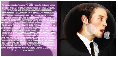


The inner cover
This was the template we were given at the beginning, and though we had some trouble trying to figure out what to do with the inside cover we eventually came up with some ideas we thought would suit Miles Kane.
We then chose two pictures that we felt were good quality and would fit with the idea that we were formulating. Since Miles Kane is a solo artist who focuses a lot on his own performance we thought that these images would be best to use.


We then thought it was still too colourful and that we needed to change the image colours to match not only the website but the outer covers. So we changed the left hand image by over laying it with their layers that had effects added to them and the opacities lowered. The first thing we did was add a dissolved layer over the top.
After that we added a layer that had a glow effect and the colours converted to black and white. We thought that this looked good and it fitted the outer layers of the digipak.
We noticed that there was no follow through with the pink that was on the front covers and the website so we added a pink layer and reduced the opacity so that it gave the image a pink filter which we thought looked decent and linked well with the colour scheme we had chosen.
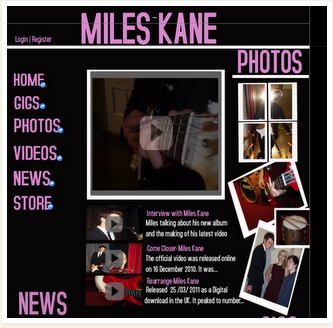
We thought that so far our cover looked quiet good and the pink contrasted well with the black and white on the right hand side. We then decided that we needed to edit the CD because white wasn't the right choice for it, as Miles Kane's own CD was plain black, and had his name on it.
 We spent a while thinking about what we could do with the CD since we didn't want it to just be plain as it wouldn't fit the criteria of the board or match our designs very well. After some thought we decided that since Miles Kane likes to promote himself as a solo artist that plays his own instruments, an image of him singing on the CD would be a good idea.

We felt that leaving the image with its original colourings wouldn't suit our theme so we reduced the opacity of the image and added a colour burn to it, so that it would stand out from the cover. We thought that the effect looked quite good but the colourings were too faded.

We enhanced the colours by overlaying the CD image with a black circle shaped that fitted over the top. It made the colours of the under image brighter more defined. We though it contrasted well with the back and white image that it covered. We also added a smaller white circle and reduced the opacity so that it looked like a proper CD.

After looking at the cover we had so far we decided that the left hand side  needed something else because it looked too empty. So we looked at some other CD covers to see what we could add and after some searching we decided that the lyrics to the song we were doing for our music video would be a good idea.
We had an idea for the left hand side then but we needed to make it fit in well with the rest of the digipak design. After some shuffling and re-shuffling we chose a white font as it was the one colour that fitted in well with our colour scheme and could be read on the pink filter. We also chose to lay out the text in one  on running line as it meant we could fit all the lyrics in and it didn't leave too many blank spaces. 


This was the cover we had when we decided that it looked good enough and fitted well with the rest of our digipak.