
Thursday, 9 February 2012
Reflection Evaluation- Charlie
How did you user media technologies in the construction and research, planning and evaluation stages?
Here is a verbal video response to question 4:
Here is a verbal video response to question 4:
Wednesday, 8 February 2012
Reflective Evaluation Question 4 - Sophie
How did you use media technologies in the construction and research planning and evaluation stages?
This is a video I created, in this video i talk about the stages of creating our digipak, website and music video.
This is a video I created, in this video i talk about the stages of creating our digipak, website and music video.
Amber's Evaluation Question Three
What have you learned from your audience feed back?
We gathered some audience feed back in various ways. The most pronounced being asking some of our peers to watch the video and fill in a Questionnaire. I've added some of the Questionnaires we received in here.
There was a lot of good feedback from the other groups, although they did highlight a few issues they had with our videos. For example a few people thought there weren't enough shot varieties in the video, and some other pointed out that they thought some of the drums weren't synced properly.
Some other weaknesses in the video, were that, as one person pointed out, the guitar doesn't look like it's really been played, which is unfortunate, but we did our best to find an actor who looked the part of Miles Kane, who would be willing to act for us, and he did try his best.
Someone else said that they felt the narrative needed a bit more development, as they didn't understand quite understand what was going on, which was something we as a group noticed when we'd finished the music video.
We also got verbal feedback from our teachers and some of our peers that didn't take media, using the youtube channel, to show them the video. We got a lot of the same comments which went towards some of the changes we made before completing our video.
Some of the things we changed after receiving feedback, was the lip-syncing and the amount of performance shots. Other people picked up on things we hadn't noticed and pointed out that they felt there should be more performance rather than dancing.
Going back and changing things we feel we improved our video, although there were some things we couldn't change, as we didn't have the opportunity to re-film. This was a little frustrating, as once the issues had been pointed out, they stuck out to us. Some other problems with the feedback was that when we went back to change things when our video was near completion, was that cutting clips and putting them in the exactly correct places was harder now, because we had to make sure all the lip-syncing was still right.
We also got some feedback that contradicted other comments, and we had to make a decision as to which we would follow.


Monday, 6 February 2012
How effective is the combination of your main product and ancillary texts?
How have you maintained a clear image and theme throughout your campaign?
Throughout all of our products we have kept an emphasis on Miles Kane (Chris) for its image which is why he is the only person featured on the digipak and has most emphasis on the website and in our video. There is also a distinct colour scheme with the Digipak and website (pink, white and black) which makes them look united; the colour scheme wasn't included in the video because it wouldn't suit the song and would look silly.
How is the website, CD cover and video interrelated? Do they have the same purpose?
Our website, CD cover and video are interrelated due to having the same content regarding actors and theme. The website and digipak are interrelated with the colour scheme. All of our products have the same purpose in regards to selling Miles Kane, by making them all similar people are more likely to recognise his 'brand' and therefore let him stand out. To make him stand out all 3 of the products focus on him.
What purpose or relationship do they all have? Do they target the audience?
The purpose is to give Miles Kane an interesting image which people will want to buy into. The target audience of 16 - 25 year olds might not be achieved due to our actors being in the lower end of the target audience spectrum (17-18), however apart from that I think it would have done ok towards our target audience due to it having a similar style to Miles Kane's previous videos with the inclusion of dancing and focus on live performance.


Other feedback sheets - Sophie
These are the other feedback sheets we collected from are audience, overall they are positive comments.
Sunday, 5 February 2012
Reflective Evaluation - Sophie-Question three
What have you learnt from your audience feedback?
To get a greater understanding of what people thought of our music video we got our peers from our media class to watch our music video and fill in a questionnaire form about what they thought about the video.
This feedback sheet showed how a male & female both aged 18 thought our music video looked professional, it held their attention and liked our mise-en-scene, locations & costume as they related to the artist and genre conventions. They enjoyed the performance aspect of our music video as it was upbeat, confident & believable. However they didn’t like the fact Miles Kane stole another man’s partner! They thought there was a wide variety of well thought out shots and that it fits the pace & tone of the song.
They gave it 33/40 marks
This feedback sheet showed how a female aged 17 thought our music video looked suitable and it held their attention. She thought that some of the drumming sections were out of time but besides that she thought it looked like a professional music video that was suitable for the artist. She thought the lip syncing was good and the performance shots were also good. However she didn’t like the facial expressions sections as they didn’t look believable and that the effects were over the top/not suitable for the type of music video.
She gave us 30/40 marks.
This feedback sheet showed us what two males one 17 & one 18 thought of our music video.
They thought it was suitable and that it held their attention they thought that the instruments didn’t look like they were being played and that it didn’t look professional, however it suited the artist type and style of music and this is because it showed a lot of the band & the performance. However they also thought that the narrative needed to be better developed to make the music video look complete. They thought the shots looked good but that there wasn’t enough variety. On the other hand they liked the special effects we did making the video turn from greyscale to colour.
They gave us 27/40 marks.
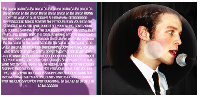
I created a wordle of the key words and phrases that have been repeated throughout all the feedback sheets, I feel that is a good way of representing the overall view of our music video. the words that are larger were the ones most repeated.

Issues were raised about the narrative some people viewed as having good potential but they thought that it wasn’t as good as some of the other elements of our music video thus making it a weak link. the drumming being out of time with the beat of the song was something else people picked up upon and looking back we could have put more time and effort into looking at the instruments to make sure they were properly in time with the beat of the song. During the editing process peer members suggested ways in which we could make our film better, for example one member of another group noticed how some of our lip syncing was out of time. We then were able to change the length of the clip to make sure it fitted into the video. I believe this help is invaluable as i believe we wouldn't have noticed this fault if it wasn't pointed out by the person.
Some of the audience feedback is things that we ourselves had no control over. One person didn’t like the song or type of music we had chosen and therefore didn’t like our song or video, we realised then that our video or the choice of music won’t be to everyone’s taste.
Some of the audience feedback is things that we ourselves had no control over. One person didn’t like the song or type of music we had chosen and therefore didn’t like our song or video, we realised then that our video or the choice of music won’t be to everyone’s taste.
We had a lot of problems throughout our filming and I believe we have done the best we could with what little opportunity we had to shot our video I believe that some comments were unfair such as one person saying our lip-syncing was out of time and another few people saying it was in time. Certain things I wish we could have changed in the editing and filming process such as getting a better camera to hire out so the images weren’t as great as we wish they could have been.
However I believe we have done very well in creating our music video and I think the overall comments were positive.
Reflective Evaluation - Sophie- Question two
How effective is the combination of your main product & ancillary texts?
 Throughout are campaign are intentions have been clear of what kind of image and style we have chosen to create, we decided as a group that the decision to add a basic narration to the music video would help make our video more interesting. When done in the Miles Kane video narration is basic and revolves directly around Miles Kane himself, in our video we had to main characters, Chris who is our singer gets more involved into the narration thus overlapping the narration and performance aspect of our piece. The style of how we want to portray Miles Kane has been very clear, the location, stylistic intentions and the outcome has maintained the same throughout are planning and creating process.
All three products have the same interconnecting style, the website, the CD cover & music video. for example the same colour schemes are used in the wesbite and the CD cover. An idea we have taken from miles kanes most recent and only album. I believe that this androgynous colour scheme is something that makes this artist stand out compared to other artists of the indie genre,appealing to both a male and female audience.

The purpose of digipacks and webpage is to support the video in what it shows. This artist has a formal tone to his performances as well as a smart clean cut image the basic colour schemes and the spacious webpage show this the webpage is organised and not chaotic unlike many other webpage’s of indie bands/singers.

The friendly fires webpage set out like a blog has few links to other areas of the site and focuses mainly on the homepage where a lot of random information of the band is put up in only a time related order e.g. tour dates uploaded followed by a behind the scene video. I think this shows clearly that the band has a connection with there fan base, making there webpage similar to a social networking site brings them closer to there audience as we are lead to believe that they are in control of there website and its something personal to them as it looks like they themsleves upload the content.
We chose not to create our webpage like this as we realised that the Miles Kane as an artist is on the other end of the indie spectrum compared to friendly fires and this organised clean cut smart layout is a running theme we kept throughout the creation of webpage, the digipak and the video itself. The friendly fires digipak is also different from Miles Kane, the imagery of a bird doesn’t relate to the band, it’s a singular image of representation.
We chose not to create our webpage like this as we realised that the Miles Kane as an artist is on the other end of the indie spectrum compared to friendly fires and this organised clean cut smart layout is a running theme we kept throughout the creation of webpage, the digipak and the video itself. The friendly fires digipak is also different from Miles Kane, the imagery of a bird doesn’t relate to the band, it’s a singular image of representation.

This is very different from Miles Kane as he is on the front cover of his digipak, with his name in bold white lettering contrasting from the black background and greyscale image of himself. This presentation of his image maybe due to the fact that Miles Kane is a lone artist and not part of a band thus making the audience perceive him in a different way to friendly fires, he needs to promote himself more to be noticed as there isn’t many singer lone artists in the indie scene.
Saturday, 4 February 2012
Reflection Evaluation- Charlie
What have you learned from your audience feedback?
After we had posted our finished video on the blog and added pictures of the clips, we got some peers form our class to watch our music and ask them to fill in a questionnaire about what they thought of the video, did it sell the artist to them and if there was anything that we could have improved on. Here are some of them:
1

This girl said that she liked the shots that were taken as there was a good variety from close ups to long shots which showed our ability with the camera. She also said that the quirky shots and the dancing fitted in really well with the song and matched well. The only thing that she said could have been improved was more shots of the dancing, however she said that she liked the performance shots which was really important to us as we were doing a indie video which heavily involved performance sections.
2

We then asked two males what they thought of our video. They said that the shots were good, the setting was appropriate and that there were some good shots and inclusion of the band which they said sold the artist to them. Furthermore, they said the lip syncing was good along with the guitar playing and the song was catchy. Their only thing to improve was the use of more narrative in detail as they wanted it to be more expansive. Although we take on what they have said, we would have to think carefully and decide if we were to do it again whether we would add more narrative as the performance is more important than the narrative.
They gave us 27/40
3
The next one was by a male and female group. They really liked our music video and were a fan of Miles Kane so this would help us if there was anything we could have done better.
They said that it looked professional, the locations and costumes were good for the mise en scene, the genre conventions were fine and sold the artist to them as well as the video. Also they said that the music video fitted well with the song as the dancing and shots from the video fitted in well with the upbeat song.
They gave us 23/40
4
This questionnaire was filled out by a all girl group. They said that the performance shots and the lip syncing were really good in our video and the video overall was suitable for the genre as well as saying that we sold the artist to them and that the shots within the video were appropriately used and fitted the mood of the song. The only criticism they had for our video was that some of the drumming was out of time, we tried before finishing the video trying to move it and change it to get in time with the beat of the track but for some reason it just wouldn't go in time.
They gave us 30/40
After looking at all of the feedback from our peers, I made a "wordle" similar to what we did with the lyrics from quicksand. I've added some of the words from the questionnaire and combined them together:

When looking at the wordle, the biggest words are the most important and the key things Such as Miles Kane ofcourse, indie , catchy, Mise-en-scene and lip syncing which are all vital and make up the majority of our video.
After we had posted our finished video on the blog and added pictures of the clips, we got some peers form our class to watch our music and ask them to fill in a questionnaire about what they thought of the video, did it sell the artist to them and if there was anything that we could have improved on. Here are some of them:
1
This girl said that she liked the shots that were taken as there was a good variety from close ups to long shots which showed our ability with the camera. She also said that the quirky shots and the dancing fitted in really well with the song and matched well. The only thing that she said could have been improved was more shots of the dancing, however she said that she liked the performance shots which was really important to us as we were doing a indie video which heavily involved performance sections.
2
We then asked two males what they thought of our video. They said that the shots were good, the setting was appropriate and that there were some good shots and inclusion of the band which they said sold the artist to them. Furthermore, they said the lip syncing was good along with the guitar playing and the song was catchy. Their only thing to improve was the use of more narrative in detail as they wanted it to be more expansive. Although we take on what they have said, we would have to think carefully and decide if we were to do it again whether we would add more narrative as the performance is more important than the narrative.
They gave us 27/40
3
The next one was by a male and female group. They really liked our music video and were a fan of Miles Kane so this would help us if there was anything we could have done better.
They said that it looked professional, the locations and costumes were good for the mise en scene, the genre conventions were fine and sold the artist to them as well as the video. Also they said that the music video fitted well with the song as the dancing and shots from the video fitted in well with the upbeat song.
They gave us 23/40
4
This questionnaire was filled out by a all girl group. They said that the performance shots and the lip syncing were really good in our video and the video overall was suitable for the genre as well as saying that we sold the artist to them and that the shots within the video were appropriately used and fitted the mood of the song. The only criticism they had for our video was that some of the drumming was out of time, we tried before finishing the video trying to move it and change it to get in time with the beat of the track but for some reason it just wouldn't go in time.
They gave us 30/40
After looking at all of the feedback from our peers, I made a "wordle" similar to what we did with the lyrics from quicksand. I've added some of the words from the questionnaire and combined them together:

When looking at the wordle, the biggest words are the most important and the key things Such as Miles Kane ofcourse, indie , catchy, Mise-en-scene and lip syncing which are all vital and make up the majority of our video.
Wednesday, 1 February 2012
Amber's Evalutation Question Two
Throughout the campaign, I feel we have kept a very clear theme. This is because through out our work we have maintained a simplistic style that is associated with Miles Kane. We’ve done this through mise-en-scene and narrative in our music video, and the layout and design of our website and Digipak.
We’ve kept to plain colours and a black and white base. For example, on the Website we’ve used black, for the background, and have edited the colours on the CD covers to be black and white. We've used pink as the only colour point on both. Using Pink for the CD Title and the website headings made them stand out against the black and white backgrounds.
We felt that this was appropriate because Miles Kane had used this styling for his previous album, the colours involved being black, white and pink. And by using something that is easily recognisable as a Miles Kane product it is more likely that our products will attract his fans and other indie loving audiences, because Miles Kane is very typical in his indie style.
The website and the Digipak are interrelated through their composition and design.
They serve the same purpose, to sell the artist and have been made specifically to do so.
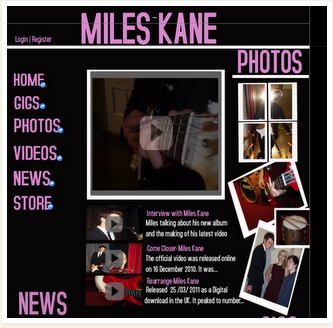
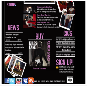
The website promotes the artist and features images of the artist performing and tour dates.
The Digipak focuses on the artist using images of Miles Kane, performing, and cementing the idea that he plays his own music, as is his goal, stated in an interview.
The music video is also interrelated with the other two products as it uses the same themes and conventions. Like the CD and Website, the music video features a very simple location, with minimalistic mise-en-scene. The narrative in the video, although maybe more expanded than in other Miles Kane videos, carries the same kind of theme that is typical of his previous examples. As it too complies with what would be expected of Miles Kane, it helps sell the artist, with many shots of our Miles Kane, playing his guitar and singing, enhancing the idea that he can genuinely make his own music. It also means that it appeals to the target audience as it follows the indie conventions.
Our website promotes both the CD and the video, as both are feature on the site, showing that all are related. The CD also matches the website in colour, images and layout, and the music video relates to both through the the way it was edited. The black and white effect used on certain shots, that fade into and out of colour match the design of the Digipak, where ever though the images is set as black and white, some comes through, although it appears very washed out. It also relates to the website because the people featured in the images on the site, are present in the music video, showing that all three products are in fact related.
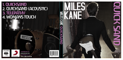
CD COVER, OUTSIDE

CD COVER, INSIDE

WEBSITE

Katy Perry's California gurls Digipak.

Screen caps from Katy Perry's California gurls video

This set of products sell the artist as Katy Perry is the main feature of the video and the Digipak, and both the video and the CD cover carry a sweet related theme making them instantly recognisable as related. I feel that though our products are from a different genre to Katy Perry, we have achieved a similar effect with the things we have created, by having a common theme running through all of our products and having our artist as the main feature.
Subscribe to:
Posts (Atom)