How effective is the combination of your main product and ancillary texts?
I feel that we have mostly maintained a clear image and theme throughout our campaign from the start. The only thing that has changed through our campaign is the use of more narrative in the video as our teachers advised that if we wanted a narrative in the video it had to be more obvious so the audience can understand it so it can be followed but not make it dominate the video. Apart from that, the idea of location and layout of it what we were going to include, the general outcome of what we wanted the music video to look like and the main singer as Miles Kane have been the same throughout.
I feel that we have mostly maintained a clear image and theme throughout our campaign from the start. The only thing that has changed through our campaign is the use of more narrative in the video as our teachers advised that if we wanted a narrative in the video it had to be more obvious so the audience can understand it so it can be followed but not make it dominate the video. Apart from that, the idea of location and layout of it what we were going to include, the general outcome of what we wanted the music video to look like and the main singer as Miles Kane have been the same throughout.
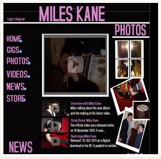
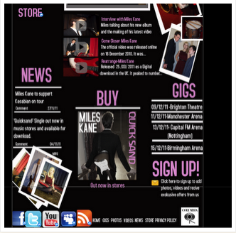
When looking at the website, CD cover and the music product itself, I think that they are all interrealaed as they all have the same ideas behind them, both the CD cover and website have similar layouts, colour text and theme behind them and the video shows the characteristics of Miles Kane and the indie genre really well. I also feel they all give off the same impression of Miles Kane with everything being simple yet effective, smart yet laid back and appeals to the indie genre and his fans.
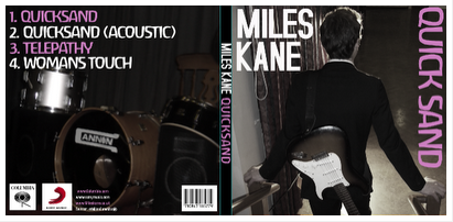
The relationship and purpose between our music video, the website and the CD cover are all formed to sell the music and the artist and achieve what the audience want as a consumer. The relationship and connection between our products is visible as the CD cover is advertised and shown on the website along with the music video itself and some of the images of the band and Miles Kane promoting him. Also images of Miles Kane are on the CD cover to promote him as a artist and images of instruments as well which can be expected on indie CD covers.
Here is a image of a digipak from Katy Perry and her album California Gurls:
 By looking at this digipak it is evident that Katy Perry has used images and ideas that will promote her album and her to a wide range of audiences. The use of candy floss and sweet things with pink clouds appeal to children and young girls as sweets are appealing at that age and looking at giant lolly pops as kids love sweets . This is also connected with her video California Gurls as she is transported to a sweety world with candy floss, gummy bears, jelly and sweets everywhere which shows the connection and relation to the video and album cover. However it also appeals to the male audience also and the shots of Katy Perry herself are of her under the impression that she isn't wearing any clothes and is posing on the front and inside cover which is very provocative and appeals to the male audience as a sexual image .


There are a few similarities between this digipak and ours. The use of having the artist on the front and inside cover to promote him and his music. Although the portrayal of his is smart and a laid back image whereas these images are more seductive and appeal more to the male audience.
Front and Back cover
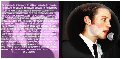
Inside cover and CD
Website
The relationship and purpose between our music video, the website and the CD cover are all formed to sell the music and the artist and achieve what the audience want as a consumer. The relationship and connection between our products is visible as the CD cover is advertised and shown on the website along with the music video itself and some of the images of the band and Miles Kane promoting him. Also images of Miles Kane are on the CD cover to promote him as a artist and images of instruments as well which can be expected on indie CD covers.
Here is a image of a digipak from Katy Perry and her album California Gurls:
By looking at this digipak it is evident that Katy Perry has used images and ideas that will promote her album and her to a wide range of audiences. The use of candy floss and sweet things with pink clouds appeal to children and young girls as sweets are appealing at that age and looking at giant lolly pops as kids love sweets . This is also connected with her video California Gurls as she is transported to a sweety world with candy floss, gummy bears, jelly and sweets everywhere which shows the connection and relation to the video and album cover. However it also appeals to the male audience also and the shots of Katy Perry herself are of her under the impression that she isn't wearing any clothes and is posing on the front and inside cover which is very provocative and appeals to the male audience as a sexual image .There are a few similarities between this digipak and ours. The use of having the artist on the front and inside cover to promote him and his music. Although the portrayal of his is smart and a laid back image whereas these images are more seductive and appeal more to the male audience.
Front and Back cover
Inside cover and CD
Website


